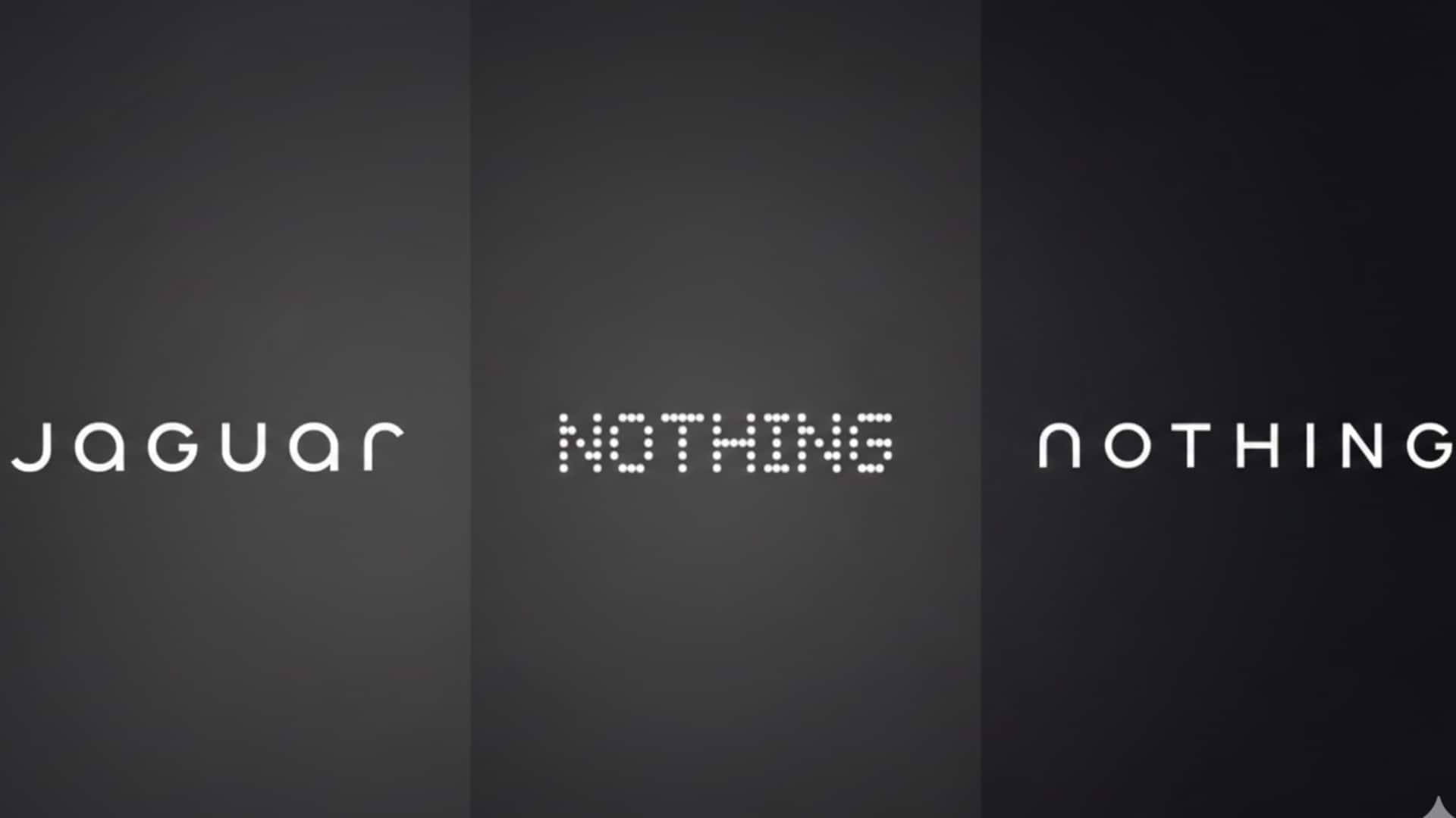
Nothing adopts Jaguar-like logo in major brand revamp
What's the story
Smartphone maker Nothing has revealed a major logo redesign on X. The move marks a major departure from the pixel-style visual identity that has defined the brand since its inception. The teaser post features the tagline "Getting ready to make history," and two monochrome images showcasing a new wordmark. It is worth noting that Nothing hasn't provided any official explanation for this change, leaving many to wonder if it's just a logo update or part of a larger brand refresh.
Design shift
Nothing's new logo: A departure from original design language
The teaser images show a cleaner, more conventional typographic treatment than Nothing's current dot-matrix and pixel-inspired branding. This move is a major departure from the aesthetic that helped the brand stand out in a crowded smartphone and audio market. If confirmed, this new logo could reflect a broader strategy to unify branding across its expanding portfolio of smartphones, audio products, and sub-brand CMF.
Public response
Internet reacts to Nothing's new logo
The teaser has triggered mixed reactions from users. While some welcomed the potential redesign as a natural evolution of the company, others feared that moving away from the pixel-style logo could take away its visual distinctiveness. Several users also speculated if this logo change hints at deeper internal or strategic changes within the company. Some users have also highlighted how Nothing's new branding looks striking similar to British carmaker Jaguar's new logo.