How Japanese calligraphy can improve modern typography designs
What's the story
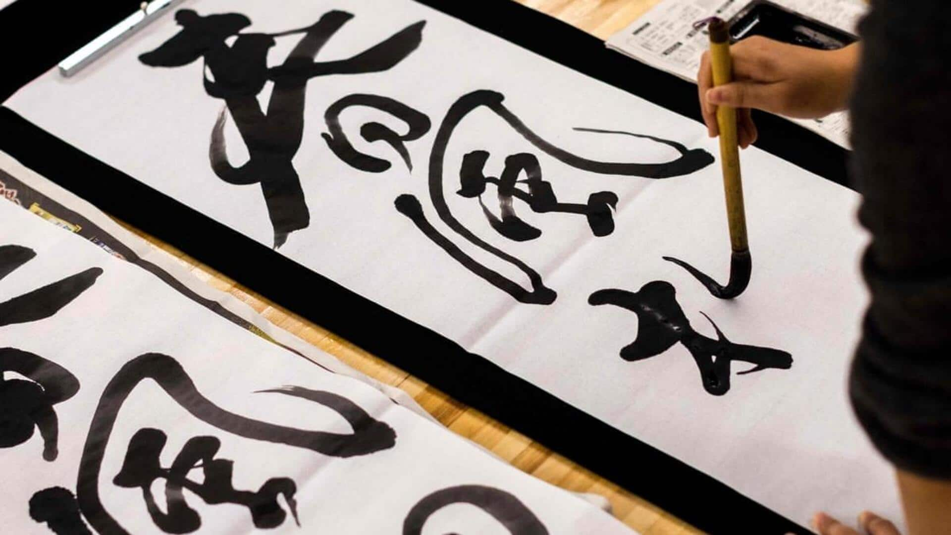
Japanese calligraphy, or shodo, is an art form that emphasizes beauty and balance through the written word. Unlike Western typography, which often focuses on clarity and legibility, Japanese calligraphy delves into the expressive potential of characters. This ancient practice offers unique insights into the world of typography, highlighting the importance of form, flow, and emotion in written communication. Here are five key lessons from Japanese calligraphy that can enhance modern typographic design.
Fluidity
Embrace fluidity in design
Japanese calligraphy emphasizes fluid strokes that create a sense of movement and dynamism. In typography, incorporating fluidity can make text more engaging and visually appealing. Designers can learn to use curves and organic shapes to create typefaces that feel alive and responsive. This approach encourages experimentation with letterforms, leading to innovative designs that capture attention.
Balance
Balance between form and space
In Japanese calligraphy, balance is key. Each stroke is placed carefully in relation to others and the empty space around it. In typography, this translates to ensuring that text is well-proportioned with its surroundings. Designers must pay attention to spacing between letters, words, and lines to achieve harmony in their layouts. A balanced composition makes content easier to read and aesthetically pleasing.
Negative space
Expressive use of negative space
Negative space, or the empty space around and between elements, is a key aspect of Japanese calligraphy. It is used to add depth and focus to the characters themselves. In typography, using negative space effectively can make designs more impactful by drawing attention to key elements without cluttering the layout. Designers should learn how negative space can enhance readability while adding visual interest.
Brush technique
The importance of brush technique
The technique used in brushwork is what makes Japanese calligraphy unique. Each stroke is made with a different pressure and speed, resulting in different thicknesses and textures. In typography design, understanding how pressure affects line quality can help you create more expressive typefaces. This knowledge allows designers to add personality into their text through variations in stroke weight.
Cultural context
Cultural context enriches design choices
Japanese calligraphy is steeped in cultural significance, which adds layers of meaning to each character written. By understanding cultural contexts, typographers can make more informed decisions that resonate with audiences on a deeper level. This lesson emphasizes the importance of considering cultural backgrounds when designing typefaces or layouts intended for diverse users worldwide.