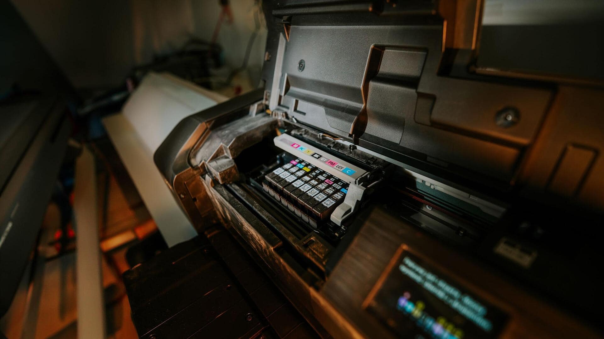
Tired of blurry prints? Try these easy fixes
What's the story
Enhancing print quality for clear text can be a game-changer for both personal and professional documents. Whether you're printing reports, presentations, or just some important information, crisp and clear text is essential for readability and impact. Here are five practical tips to enhance your print quality without investing in expensive equipment or materials. These simple adjustments can make a world of difference in how your printed materials are perceived.
Tip 1
Use high-resolution images
When printing documents with images, always use high-resolution files.
Low-resolution images can appear pixelated or blurry when printed, which affects the overall quality of the text.
Aim for at least 300 DPI (dots per inch) for images to ensure they appear sharp and clear.
This is especially important for graphics like charts or logos that accompany your text.
Tip 2
Adjust printer settings
Tweaking your printer settings can go a long way in improving print quality.
Make sure you select the right paper type and quality in the printer preferences menu.
For text-heavy documents, select "Best" or "High" quality mode instead of "Draft" or "Normal."
This ensures that the printer uses more ink and takes more time to produce clearer results.
Tip 3
Choose appropriate paper
The type of paper you choose also plays a vital role in print quality.
For best results, use paper that is compatible with your printer type—inkjet or laser.
For inkjet printers, opt for bright white paper with a smooth finish to absorb ink better.
For laser printers, choose heavier stock if needed to avoid smudging.
Tip 4
Maintain your printer regularly
Regular maintenance is key to keeping your printer in good shape and ensuring it delivers the best quality.
Clean print heads regularly to avoid clogging, which can lead to streaks or missing lines in printed text.
Also, check alignment settings frequently; misalignment can cause blurred or double images/text.
Tip 5
Use professional fonts
Selecting professional fonts also contributes significantly toward enhancing text clarity when printed out.
Stick to standard fonts like Arial or Times New Roman, which are designed specifically for legibility even at smaller sizes.
Avoid overly decorative fonts as they may compromise readability despite appearing attractive on-screen.