Apple continues Liquid Glass design modifications ahead of September launch
What's the story
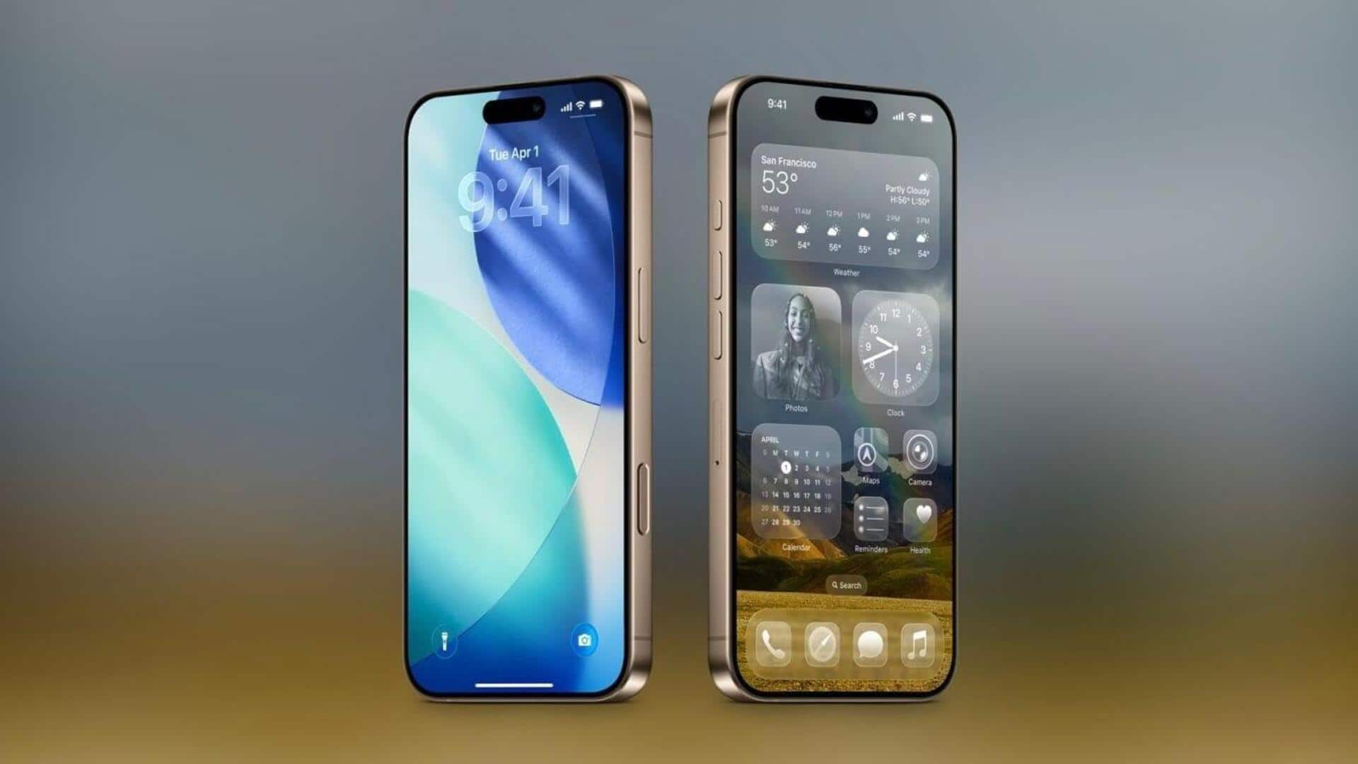
Apple has made some changes to the Liquid Glass design in iOS 26 Beta 6, with a major focus on the Lock Screen clock. The latest update brings more transparency to the clock, making it look like a floating element that fits well with the overall Liquid Glass aesthetic. However, this increased translucency could make reading the time difficult against some darker backgrounds.
Design tweaks
Control buttons updated
Along with the clock, Apple has also updated the control buttons in this beta version. The buttons now retain their original Liquid Glass style, but the icons have been enlarged for better visibility. However, Lock Screen widgets remain unchanged in this beta version. These changes are part of Apple's ongoing efforts to refine the Liquid Glass look ahead of its launch in September.
Design evolution
Liquid Glass was design unveiled at WWDC 2025
Apple had unveiled the Liquid Glass design with iOS 26 at its Worldwide Developers Conference in June. The new look is a major departure from traditional designs, featuring a translucent interface that reflects and subtly distorts background elements. This creates a more dynamic and visually engaging user experience. During the beta testing phase, Apple has made several tweaks to perfect this innovative design.
User feedback
Addressing readability issues with accessibility options
Despite the modern and elegant look of the Liquid Glass design, some users have reported readability issues, especially against certain backgrounds. To tackle this problem, Apple has introduced options in the Accessibility settings to reduce transparency and improve contrast. This way, the tech giant ensures that its innovative design remains practical for all users.