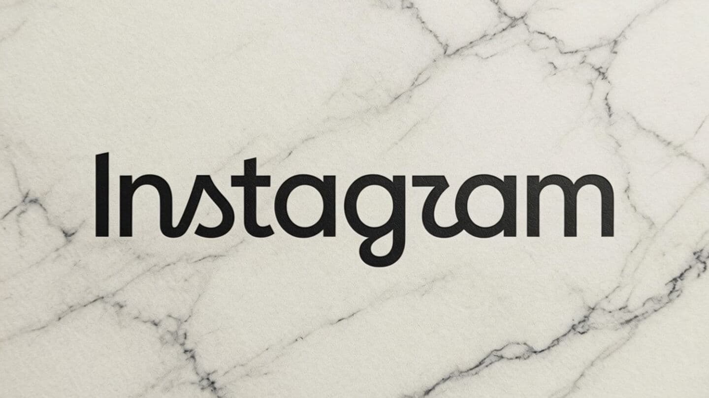
'Instagram' or 'Instagzam': New wordmark logo sparks jokes online
What's the story
Instagram has unveiled a new wordmark logo, its first major update in 10 years. The change was announced by Adam Mosseri, the head of Instagram. Mosseri described the new design as "sharper and more modern" while still paying homage to the original logo and retaining its simplicity. The last major update from Instagram was in 2016 when it replaced its classic brown camera with rainbow stripe with a colorful pink gradient icon that is still used today.
Official comment
Mosseri explains the reason behind the redesign
"The wordmark at the top of the app hasn't changed in 10 years, so it was time for a refresh," Mosseri wrote in a post on Instagram.
He added that the new design is "Cleaner and more modern, with references to the original and the simplicity and craft that's always made it Instagram."
The updated wordmark retains Instagram's signature script style but features redrawn letterforms.
Public response
Users react to the wordmark update
The redesign of the Instagram wordmark has received mixed reactions from users. While some have praised the change, others have expressed disappointment.
Many users even joked that the updated wordmark looks like it reads "Instagzam," referring to the shape of the font used for "r."
Despite these reactions, Mosseri emphasized that the new design is a nod to its predecessor while also being modern and clean.