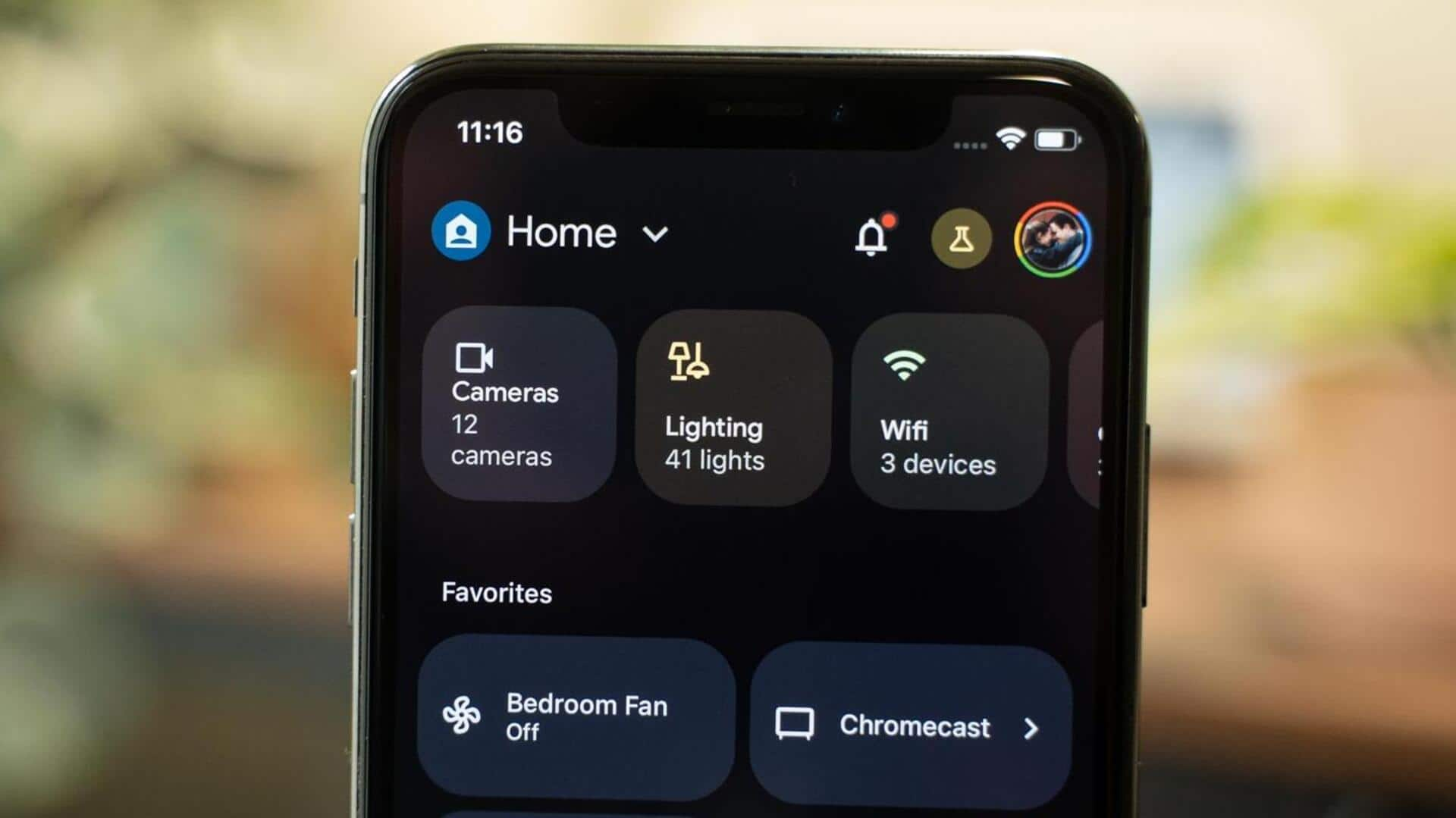
Google Home app gets Material 3 redesign for media controller
What's the story
Google is giving its Home app a major makeover with a Material 3 redesign for the media controller. The change was first previewed in November last year, and now it is being rolled out to Android users as part of version 3.37 of the app. The update isn't available on iOS yet, but it promises improved UI reliability and performance along with alignment with Google's latest design standards.
User interface
Now Playing card similar to Pixel's notification shade
The redesigned media controller offers a now-playing card, similar to the one seen in Pixel's notification shade. It displays what you're currently watching or listening to, along with a play/pause button on the right. A timeline scrubber is also included at the bottom of this card, along with previous and next buttons on either side.
Device control
Volume slider replaces circular version
The redesigned media controller also features a volume slider, replacing the previous circular version. For Google TV devices, an "Open remote" shortcut has been added. There are also full-width buttons for "Stop casting" (or "Cast my screen") and opening the responsible app. The Nest Hub Max even lets you directly view your Nest Cam feed from this updated interface.
Aesthetic enhancements
Dynamic color for a more seamless look
The active buttons in this redesigned media controller are pill-shaped, while inactive controls are rounded rectangles. The design also uses Dynamic Color for a more seamless look. Google had previously promised "faster performance" with this "easy-to-use interface." The release notes for version 3.35 of the Google Home app refer to this update as a "Cast controller refresh," which is currently in public preview for Android users.